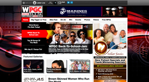
Have you ever gone to your favorite radio station's website looking for simple information and left immediately because it was too cluttered? Was it difficult to find what you were looking for?

I've noticed that many radio stations throw a lot of competing elements on the front pages of their sites. Flashing ads and multiple sections with large type. Everything is important so nothing is.

I understand that there are several goals that have to be met. Generating ad revenue. Providing information that a cross-section of visitors want to read. And what tends to be the largest goal, appeasing higher ups who want front and center placement.

There just has to be a better way to do it. One that allows them to reach advertising goals but still has a user-centered focus.
So, what do you think? Are radio station websites too cluttered? Or are they reaching their intended audience?
Comments
Yes, yes, and yes!!! I avoid goin to them unless absolutely necessary because I immediately get a headache! They are difficult to navigate, and ther harms to be a better way to achieve their goals, ugh. We should start a rally, to redesign radio station websites, lol!
Author
Until I did some research I was starting to think that I was the only one who couldn’t stand these sites. And yes we should start a rally. LOL